My husband and I bought our first house together in 2014. We were newly engaged and had found our forever home. It was a new construction house and had almost everything that we were looking for. One of the things that we fell in love with about this house is the location. It is only three blocks away from the Cooper River; which offers running trails, parks, ice skating and a great view of Center City. It is also only blocks away from the restaurants and shops on the main street. Everything is walkable and worth every penny of property taxes we pay……………………………………
So when we found our family dream home, we knew that is wasn’t going to be perfect. There were sacrifices to be made. The house hunt had proven to us that there is no perfect house no matter where you are looking. It was our job to find a house and make it perfect for our family.
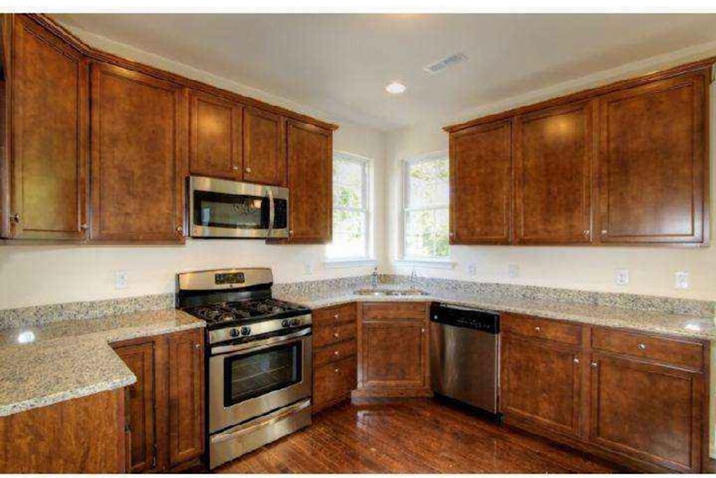
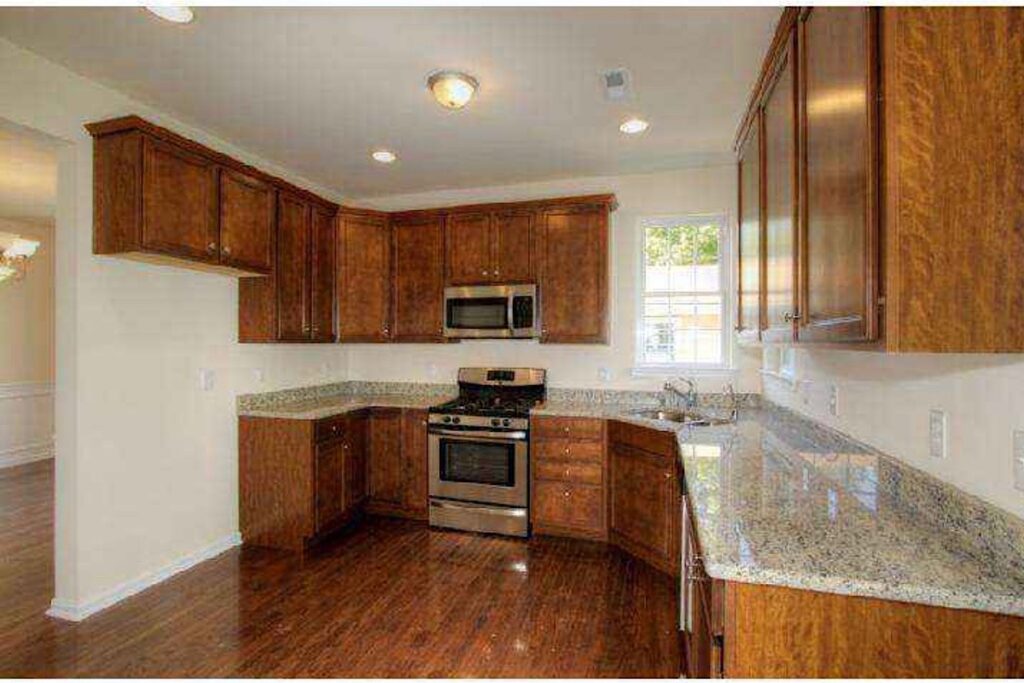
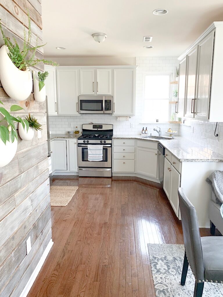
One of the sacrifices that I made was the kitchen. It is an L shaped kitchen and not so great for entertaining. When we purchased the house, we decided that we would blow out a wall and expand the kitchen to make it grander. However, as anyone that has ever bought new construction knows, there are other things that become a priority. For instance, the first summer we didn’t have a deck or a patio. So we would sit with our lawn chairs in the grass and try to pretend that the mosquitos weren’t eating us alive! From there it became apparent that a patio was more important than making our kitchen entertainment-friendly. Besides, we weren’t sure if we would get our money back putting it into a kitchen that was already in perfect shape and brand new. So patio is was. The kitchen would be our next project.
But after living in the house for 3.5 years, and two babies later, we decided that it would be more practical to finish our basement. My husband wanted a man-cave and the boys were starting to get rambunctious. We knew that during the winter months, a basement would be a great place for them to run around and play. So play-cave it was. Sorry, husband. Man-cave will have wait.
After the basement was completed, we decided that instead of pumping a ton of money into a completely functional kitchen, it made more sense just to make a few minor cosmetic changes. The changes were inexpensive but completely changed the style and aesthetic of our home. It created a kitchen that felt more personal and less, uh, builder-grade. Listed below are just a few minor changes we made to personalize and transform our kitchen on a budget.
BACKSPLASH
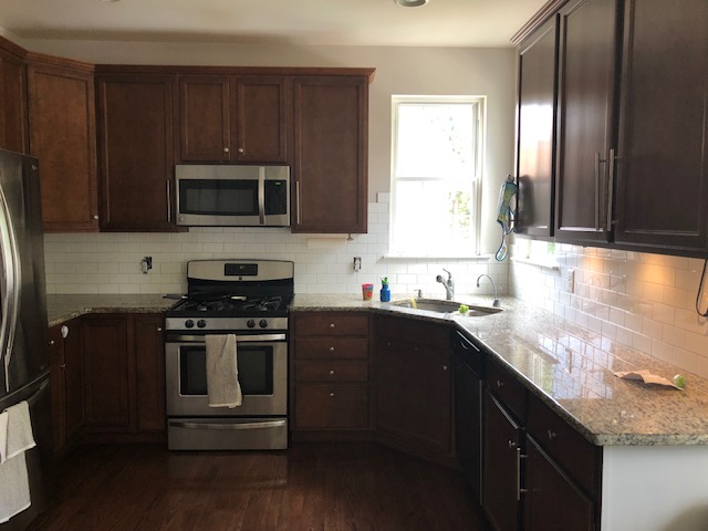
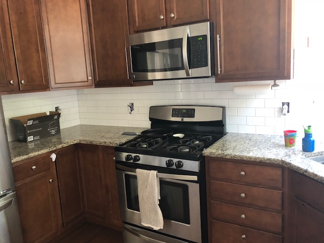
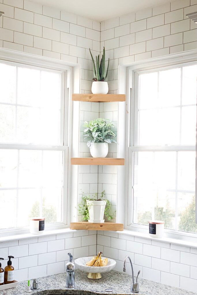
We started with the backsplash wall because that was an element that could really offer the brightness that I was looking for. I thought we might be able to get by without painting the cabinets. For the backsplash, we (I) wanted to achieve a clean, slightly modern, transitional aesthetic. The biggest factor was that it needed to blend well with our busy builder-grade granite. It was a no-brainer to go with a white subway tile. The shiny white would contribute to the brightness that I was trying to achieve along with a clean and timeless aesthetic. One of the things about tile that I hadn’t thought about was grout color. So when our installer was ready to go I had to make a decision on the fly. It was probably for the better because I could have analyzed grout colors for months! I couldn’t believe how many colors were available and how much the color changed the aesthetic of the space. In the end we went with Polyblend Delorean Grey. This color gives some contrast between the tiles and the grout, but the design is still clean and quiet so it’s not competing with the granite.
Cost: About $500
Note: We bought the materials and paid our handyman in cash to install. This helped get our cost down.
CABINETS
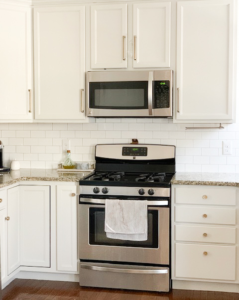
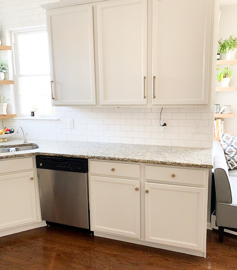
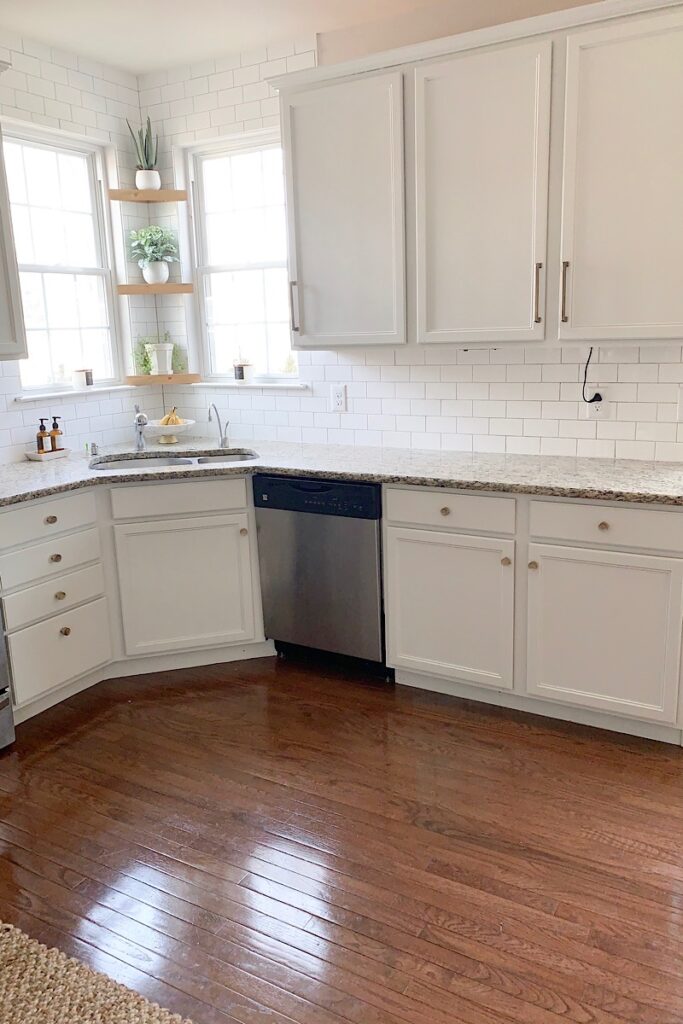
Next up was selecting a cabinet color. After I lived with the new backsplash for a few months, I decided that it didn’t brighten up the space as much as I would like. Besides, the cabinet color was too dark for the space because there wasn’t enough natural light coming in. The floors and the cabinets were also the same stain so they blended together making the kitchen look and feel smaller that it actually was.
I will admit that the hardest part throughout this entire process was picking a paint color. I didn’t want to go with white, but I also didn’t want something too cool or too dark grey. We ended up selecting Benjamin Moore Grey Owl. It is a creamy warm grey, which blends well with the builder-grade, cream under-toned granite counter top.
Cost: $900
Note: We were able to keep this cost down by paying the painters in cash.
CABINET PULLS
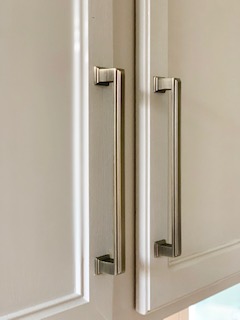
Lastly, the old knobs were not working for me so I searched Home Depot, Wayfair, Lowes and All Modern for their perfect pull. This was an exhausting search. I liked the antique bronze look but not the styles they were coming in. I needed something transitional to match the rest of the kitchen but what I was finding was ultra-modern. After an extensive search, I finally settled on a transitional/modern pull that really enhanced the cabinet design. I’ve actually had people ask if we bought brand new cabinets since putting these pulls on. They really modernized the face of the cabinets.
Cost: Free. Home Depot messed up our delivery so they sent us new ones free of charge.
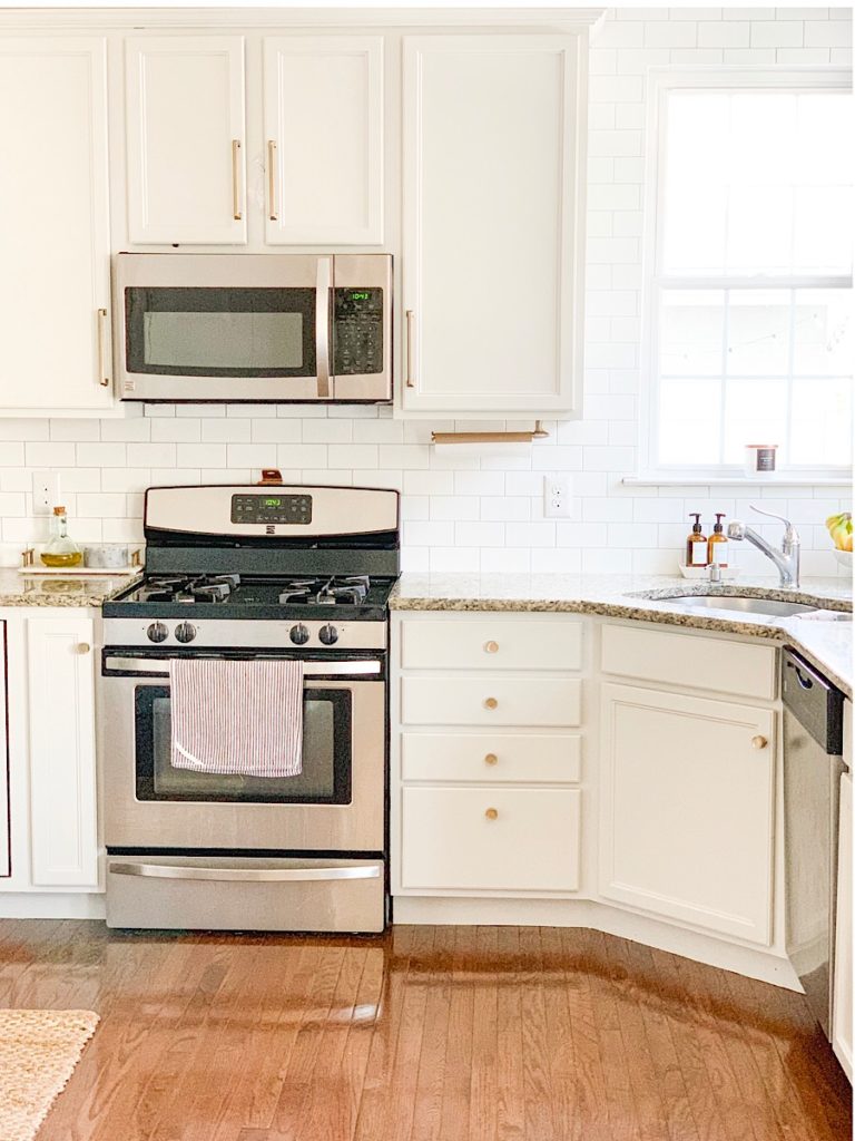
In the end, I’m really happy with the way this kitchen transformation turned out. While it isn’t my dream kitchen, it is a kitchen that I enjoy spending time in because I have made it my own. It now feels modernized, airy and clean. The total amount that we spent on this kitchen upgrade was about $1500. Not bad for such a dramatic change!

AFFILIATE DISCLOSURE
Sweet Motherly participates in affiliate programs, including Rewardstyle and the Amazon Associates Program. Sweet Motherly earns commissions from qualifying purchases made through links posted.


Love this!