I’m This is a blog post that I’ve been super excited to share with you all! If you’ve been following along on IG/FB stories, you saw that this renovation turned into a massive project (and headache) that ended up affecting all levels of our house! *Cue the HGTV cameras!! The basement floor had to be dug up, because the footers were not deep enough, according to the structural engineer. And the upstairs needed extra supports in Owen’s bedroom to help support the open concept of the kitchen.
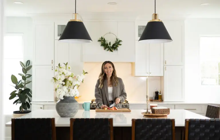
Well after all the headaches, it was all worth it in the end because we are THRILLED with the way this project came together! We are finally finished with the renovation and I can’t wait to share with you the before and after. You won’t even believe that it’s the same house!
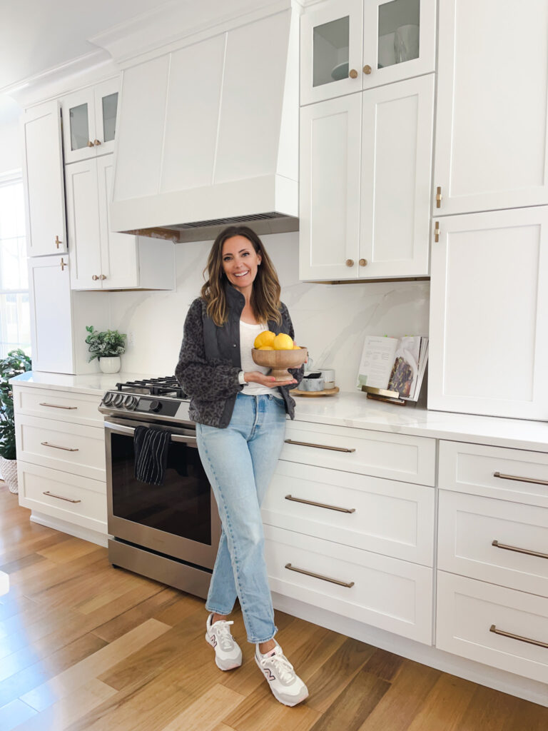
I did a ton of research on Pinterest and Houzz before we started this project so that the builder would have a strong idea of what I was looking to achieve aesthetically.
All of my PINTEREST INSPIRATION BOARDS: Hoods | Nook | Kitchen | Living Room | Dining Room
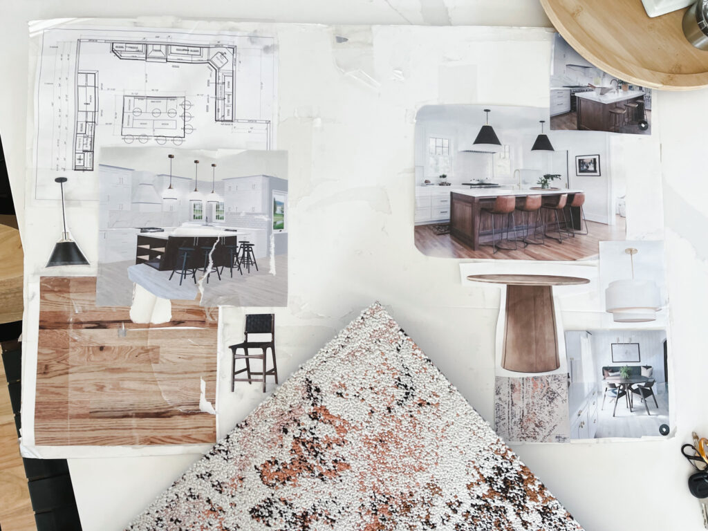
I also wanted to feel confident in my design at the end of the day and the only way that I could do that was by creating a vision/design board from the images that I found. I highly recommend this for anyone looking to gut an entire space in the their house. It’s also great if you’re moving into a new space and just want to wrap your head around the design direction that you would like to achieve.
The design board (below) really allowed me to visually keep my aesthetic consistent throughout the first floor. I also worked with the kitchen cabinet supplier, Cabinets of Collingswood, to get 3d renderings of the cabinets. Since the cabinets were a bulk of the investment and the anchor in the space, I needed to make sure I had a 3D rendering of the kitchen. We ended up going through 2 or 3 tweaks before it looked just right to me.
Before and After Reveal
The images on the left are what the house looked like right before we moved in 8 years ago. It was as basic builder grade as you can get! But we didn’t care. We were thrilled with the location, 2 car garage (rare in our area) and 4 bedrooms.
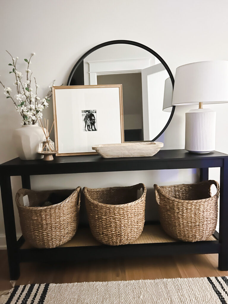
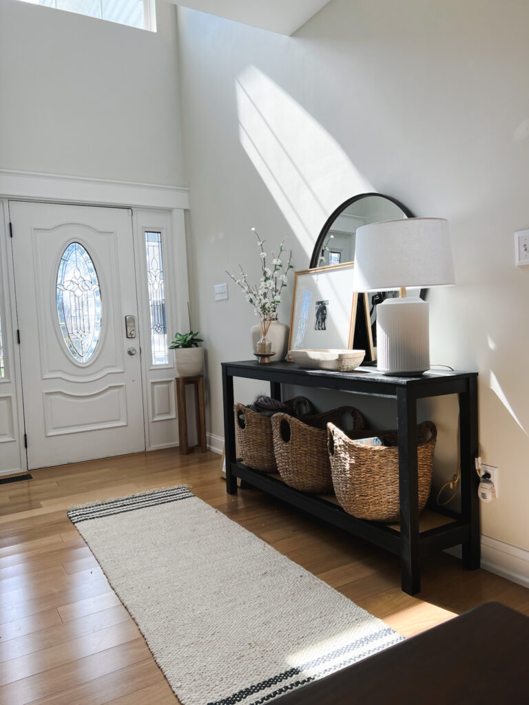
The Foyer
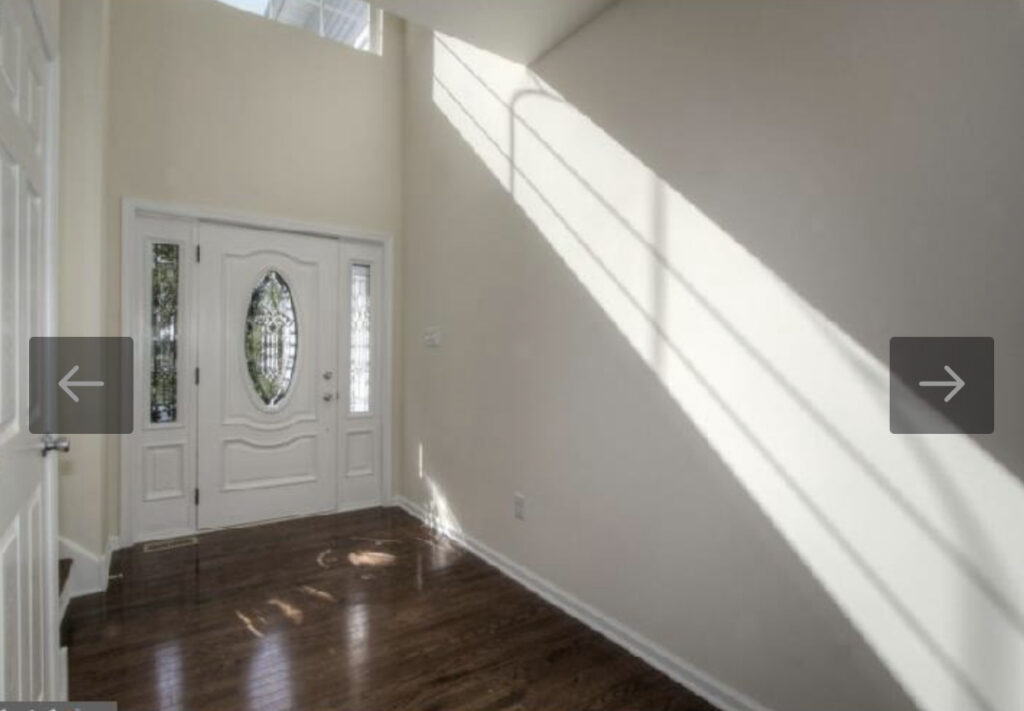
FLOORING: Not much was done to this space other than the flooring, which really helps brighten up the space. We used a contractor in Philly and the flooring is a Brazilian Oak by BTP Floors. We love the variation in the wood and I wanted real wood vs. LVT. These are prefinished so we didn’t need to find someone to stain and finish them after they were installed. I’ve had a lot of question on the specks so here is a photo!
PAINT: I used Benjamin Moore Intense White throughout the entire first floor.

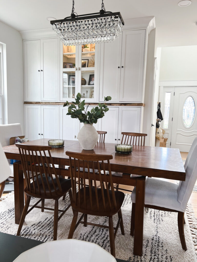
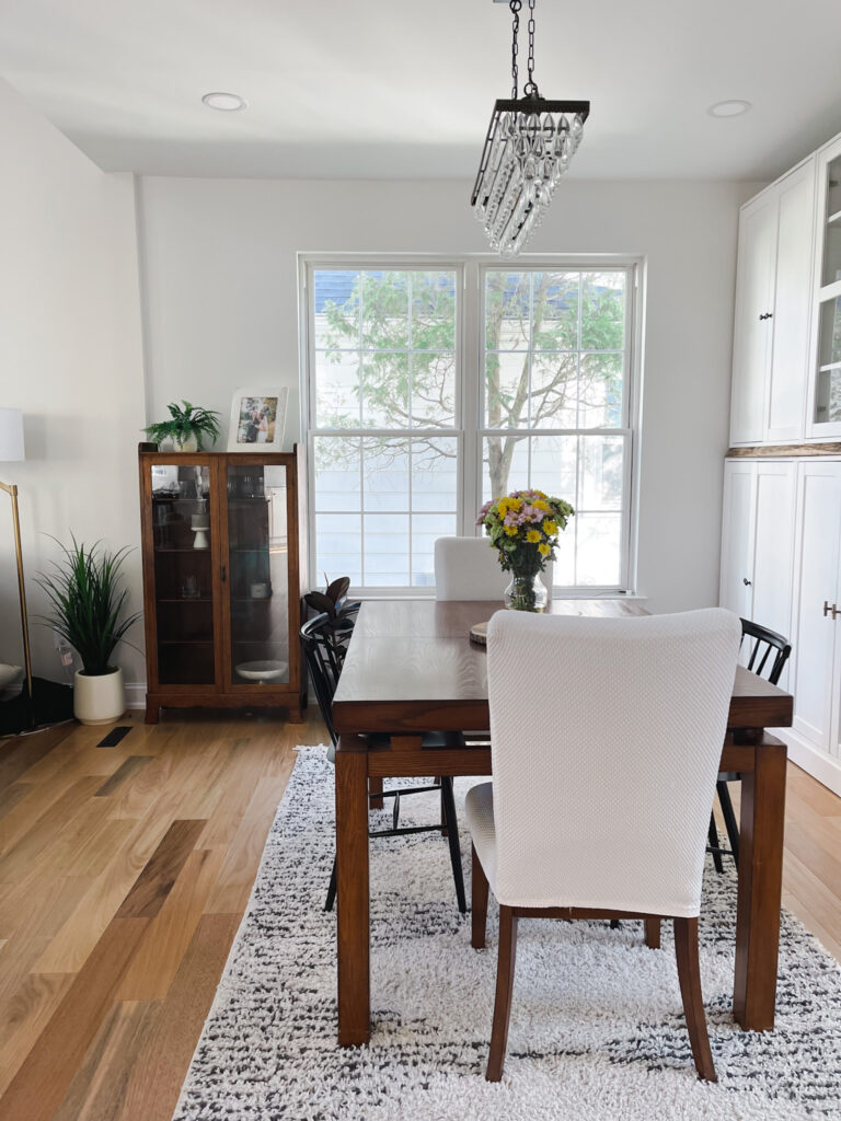
The New Dining Room/Foyer
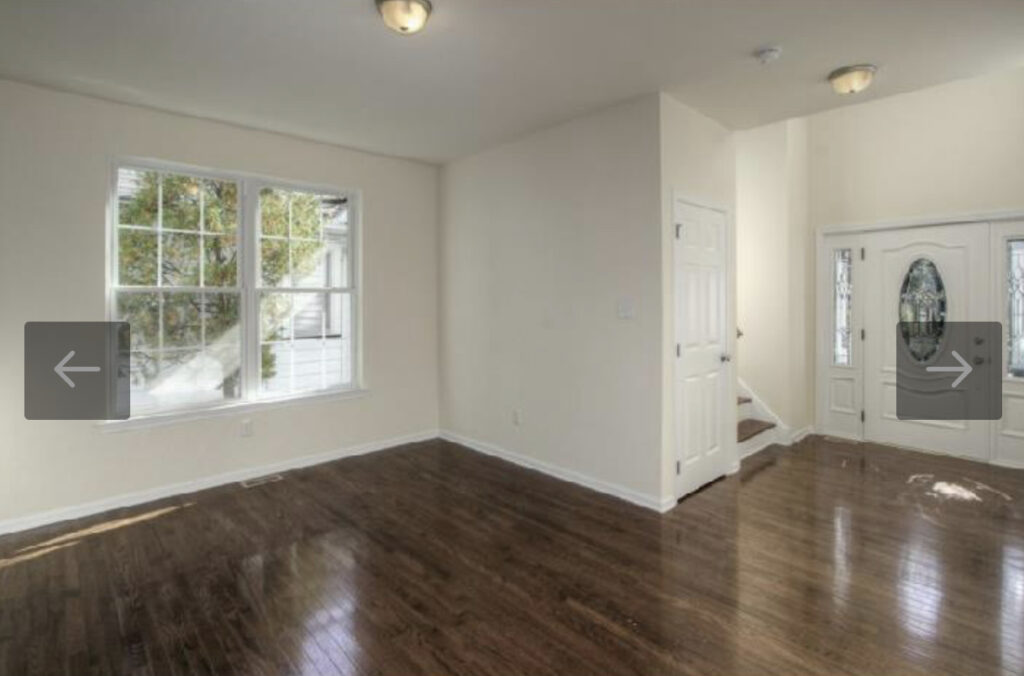
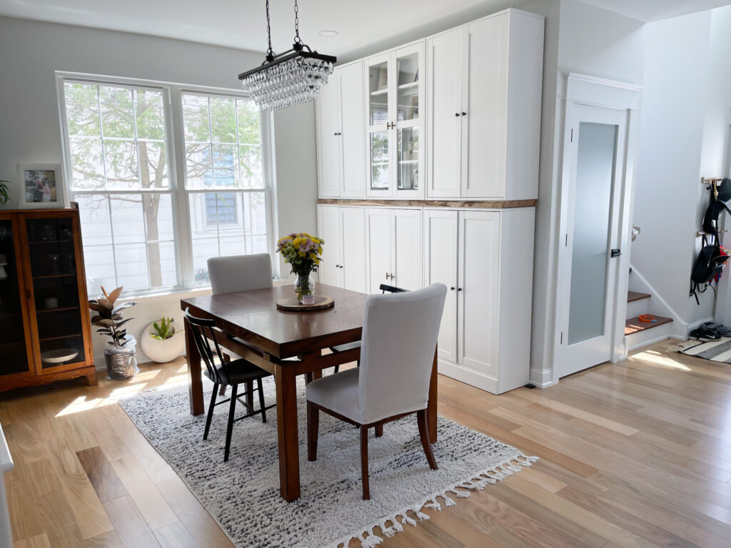
This space wasn’t meant to be a dining room but I wasn’t sure what to do with it after we moved in. So I ended making this open area our dining room and turning the actual dining room into an office. We installed cabinets from Ikea to add storage to the space and make the wall look like it has built in cabinetry.
You can see that project HERE!
The Old Dining Room
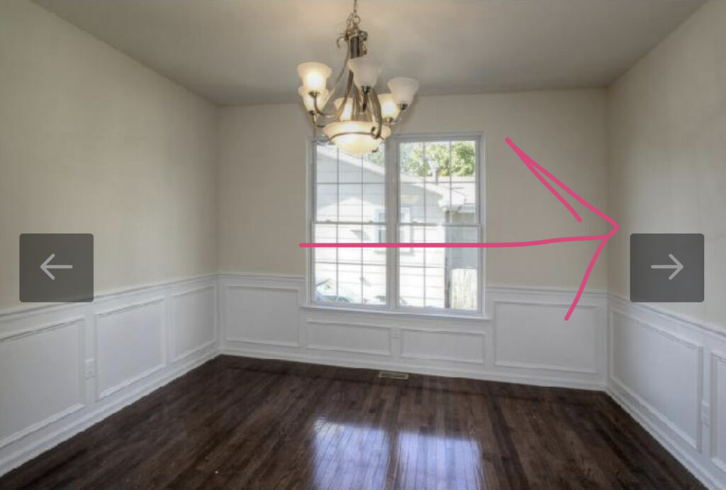
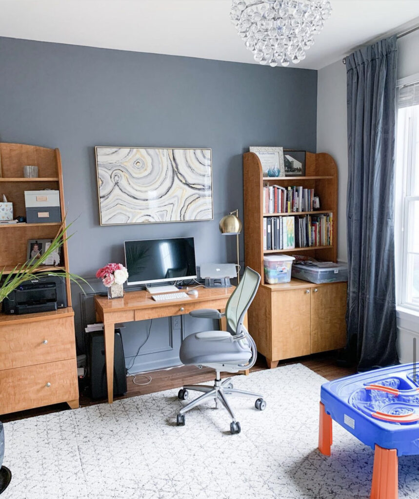
With real estate at a premium in our area, the actual dining room was completely wasted square footage in this house. We opened up the wall (and moved it over) while also changing the location of the garage door. It really allowed us to utilize the first floor space to it’s full potential. While this space did work for us as an office for many years, it just wasn’t healthy to have it so conveniently off the main area. I constantly walked past the space and really wanted a door to just close off the space so that I didn’t have to think about work on the nights and weekends.
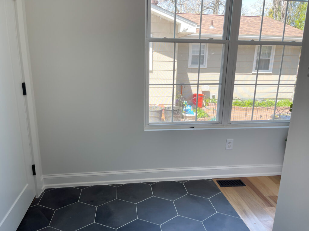
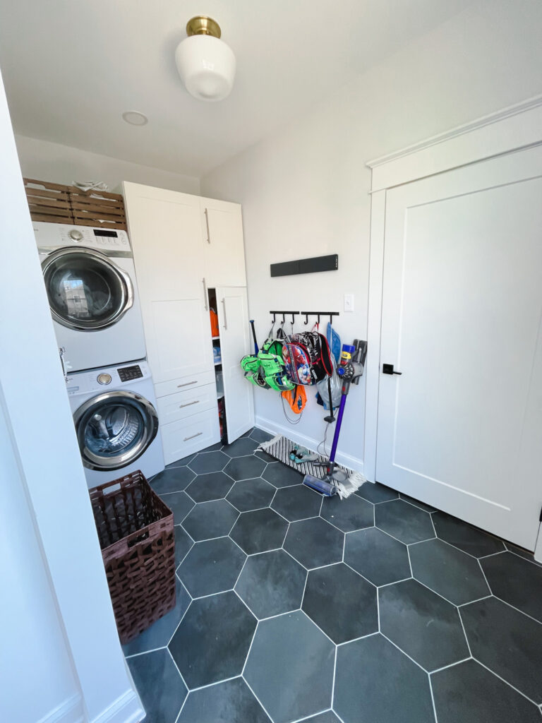
Discreet Drying Rack | Hooks | Wash Basket | Rug | Light Fixture
So the old office space is now a back of the house area that serves as a mudroom and laundry room off of the kitchen. You can also enter through the garage so when the kids come in from the rain or snow, they have a place to drop all of their dirty/wet clothes. It makes so much more sense to use the space this way as we never really had an area to hang the kids stuff in. I like to keep my spaces clutter free, but the excess bags on the wall don’t bother me because it’s in a place where no one else sees.
The Living Room
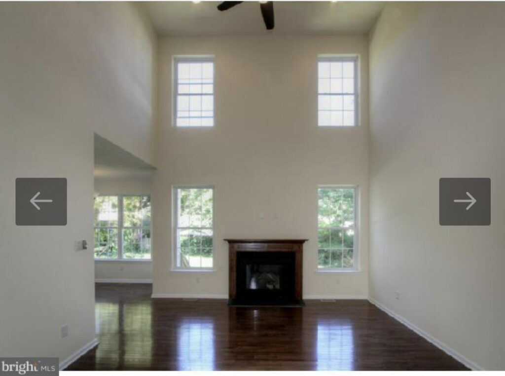
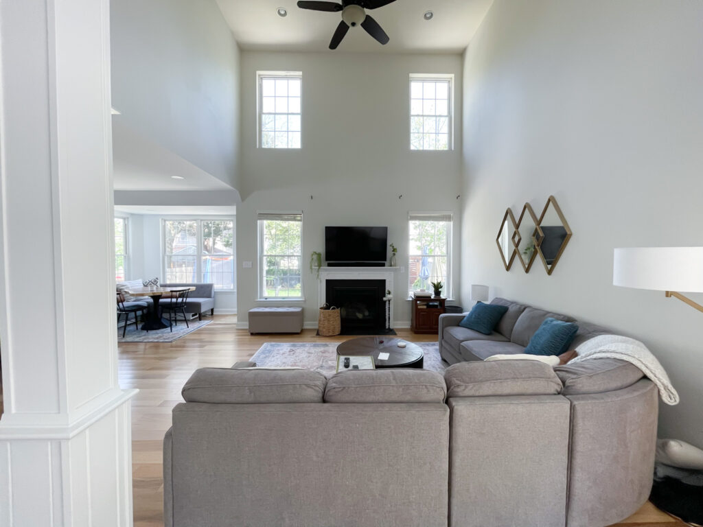
FIREPLACE: We painted the mantel almost immediately from this walnut color to white. I used Benjamin Moore Decorators White. The wood looked cheap so the white helps bring out the fireplace, instead of blending in with the floor dark floors.
Our plan with the big renovation project was to overhaul the fireplace and have it really anchor the space by making it more of a statement piece. However, time and budget got the best of us, so we decided to leave it alone (for now).
The Kitchen
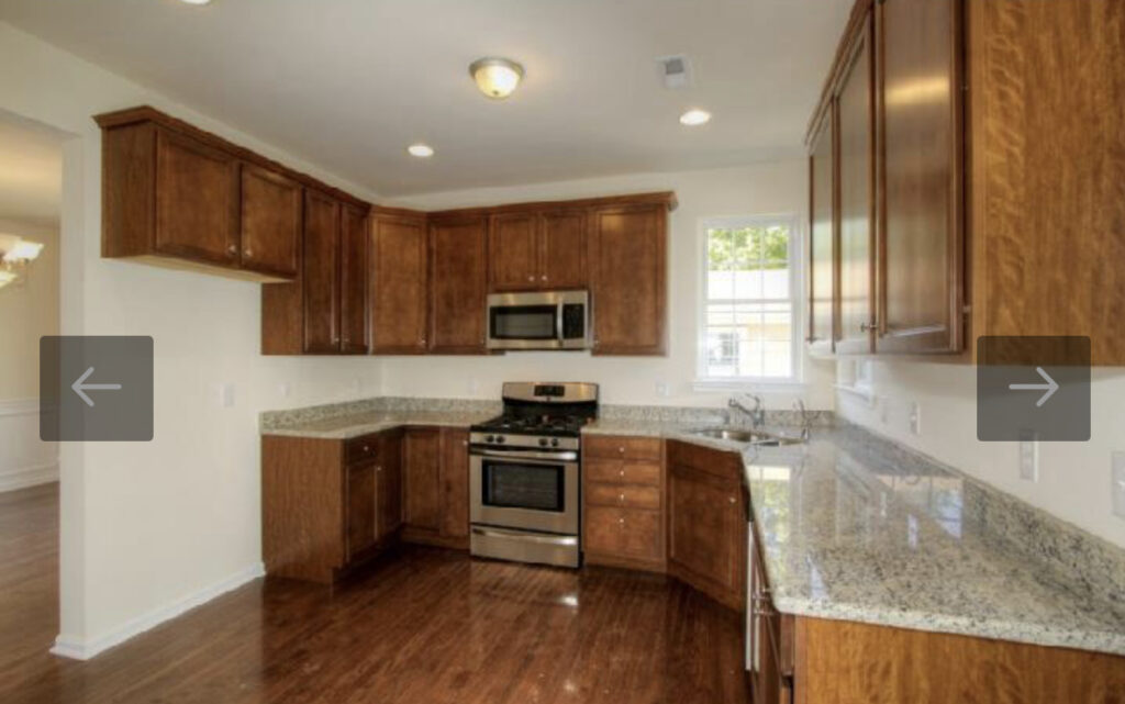
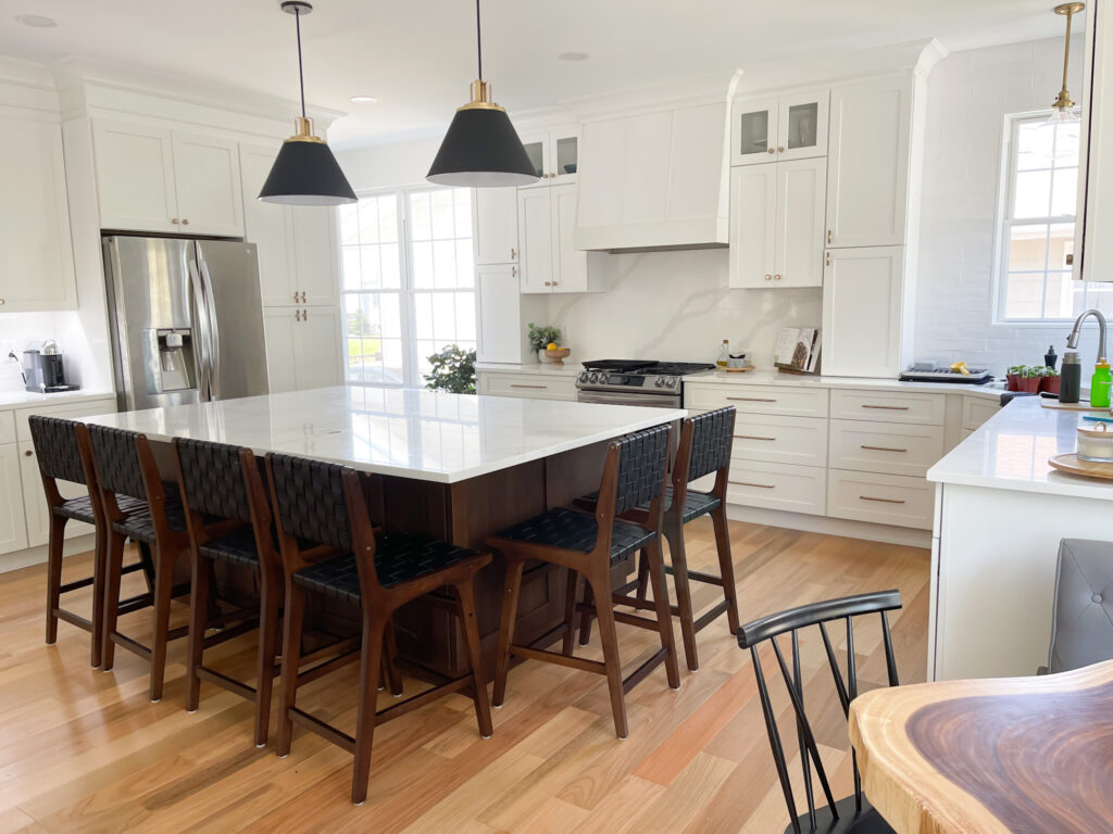
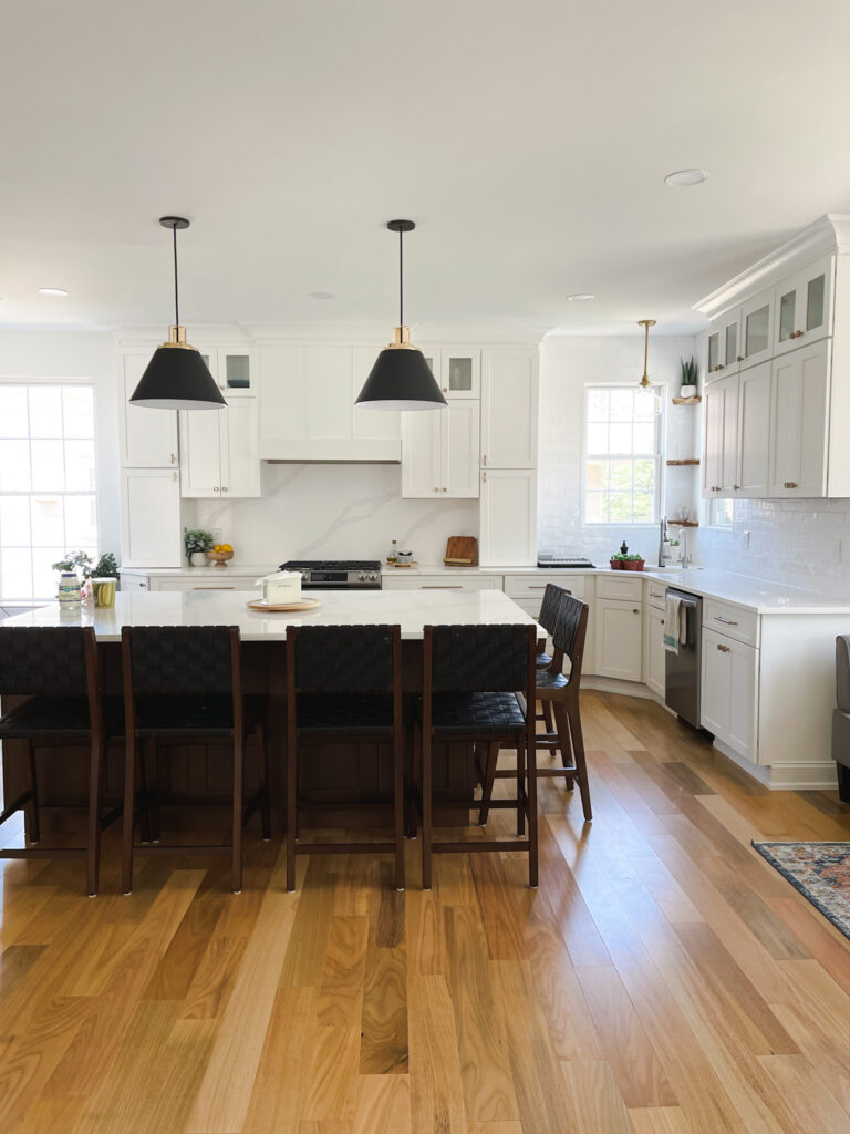
Oh the kitchen, how I was ready to see that go! It has builder grade written all over it! Yes, it was perfectly functional, but it was just too small for our growing family. With the footprint of the house, it really should have been designed as a grander space in the first place. I don’t know what the builder was thinking when they walled everything off around the heart of the house!!
1) The Nook
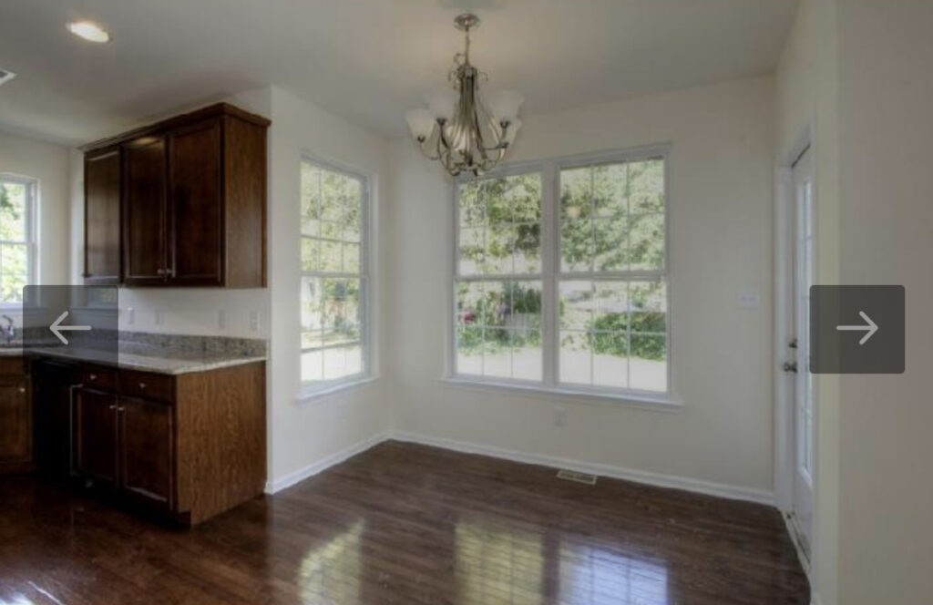
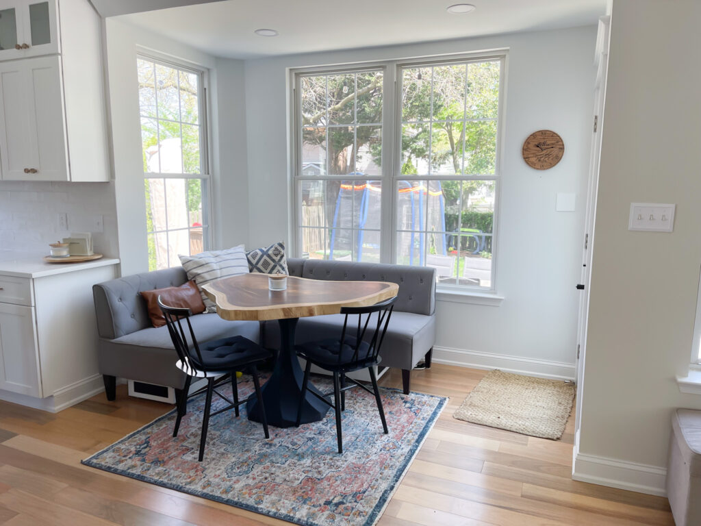
Another awkward space in our house that I wasn’t sure what to do with. So after living in the space for a few years, I decided to make it a breakfast nook. It really is a perfect space for this banquette and I find myself sitting there often for lunch, coffee or just to read a book. It’s my favorite spot in the entire house!
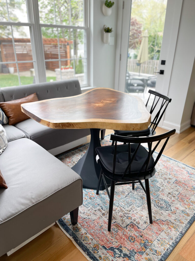
The table is the shining star of the entire space. That live edge slab of wood paired with this beautiful black matte sculptural base is truly a work of art. The top came from a local shop in Collingswood, NJ called Dig This. The owner, Reed, purchases wood slabs from a mill in Pennsylvania. This particular species is Monkey wood and the size is just perfect for the space!
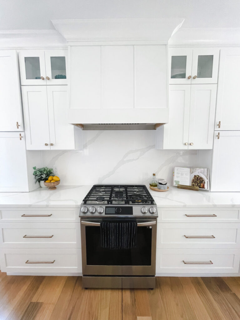
2. The Hood/Cabinets
3. The Bar
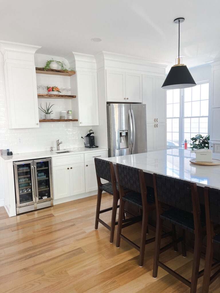
4. The Island
AFFILIATE DISCLOSURE
Sweet Motherly participates in affiliate programs, including Rewardstyle and the Amazon Associates Program. Sweet Motherly earns commissions from qualifying purchases made through links posted.
